This is the latest version of my guide to doing digital comics illustration, on a budget.
I’ve been using digital drawing tools since it first became possible, first pointing and clicking with a mouse on pixelly screens, then connecting a 5-inch “digitizer” (as they were called in those day) to my desktop computer. But it’s only been in the past decade or so that digital tools have become good enough to be empowering tools for serious artists. You can skip traditional media altogether, and go from sketching a layout, to finishing the work, all on a screen.
 But there’s a common misconception that this requires spending a lot of money. You can. And if you have it, you probably should, because you can get some pretty fine tools for, say, $5000. But you don’t have to. You can equip yourself with the same tools that I use for under $500. And if you’re intent on it, you can at least get started for about $50.
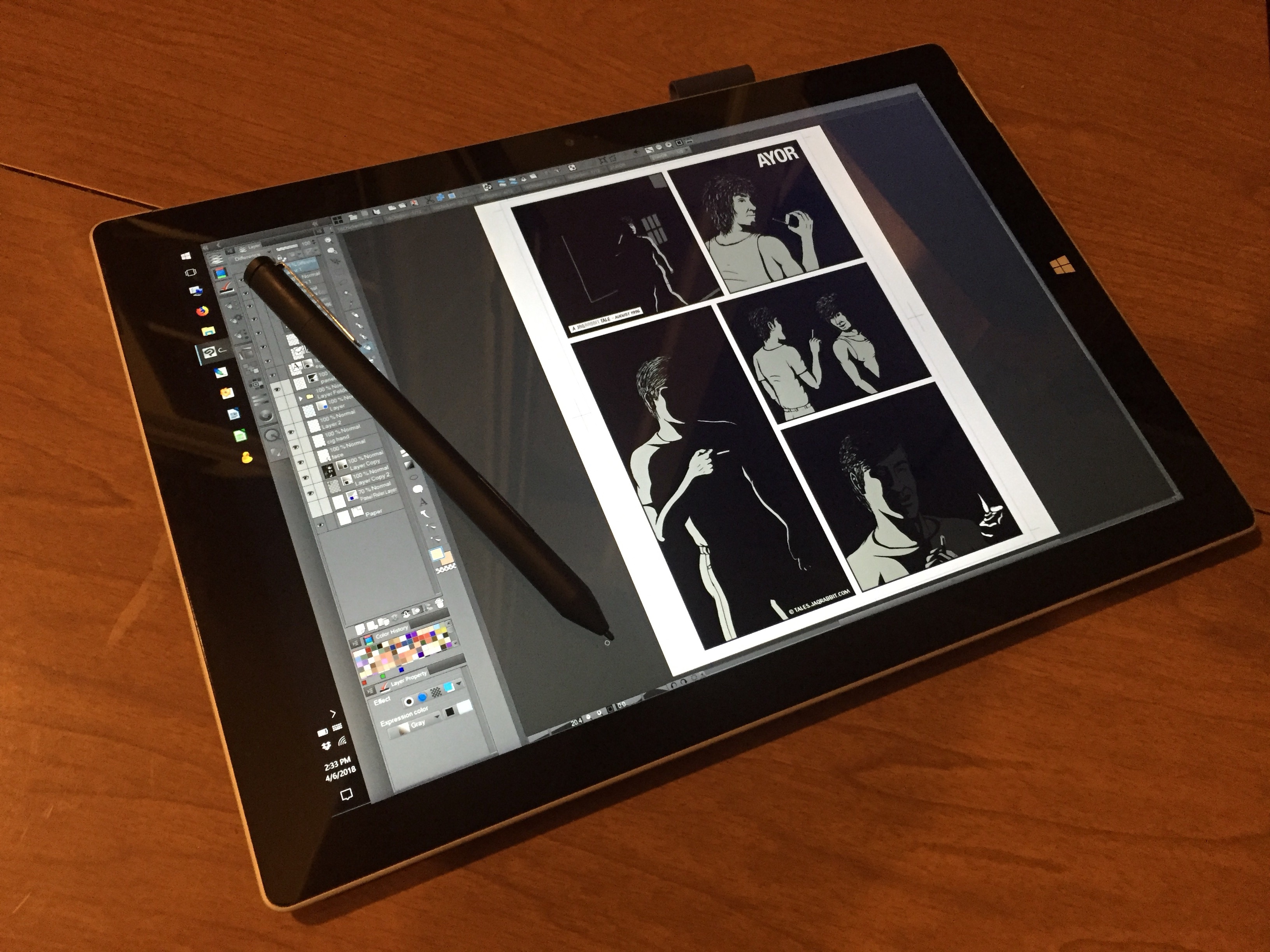
I’ll go into other options in a bit, and I’ll get to the how-to-do-it-super-cheap even farther down. But this is going to be a long article, so I’m going to start with the gear I use and recommend: my tablet is a Microsoft Surface Pro 3 (the mid-line Core i5 model), my stylus is a Wacom Bamboo Ink, and the main software I use is Clip Studio Paint EX. None of these is perfect, and in fact I have some gripes about each of them. But they have some significant – sometimes profound – advantages over the alternatives.
Hardware
I’ve been using Apple computers since the 1980s, and have a long-running dislike for Microsoft as a company. So I’m as surprised as anyone to really like the Microsoft Surface. I still hate Windows, including version 10, but you know what? It doesn’t matter. Windows is just a layer of software that I install my drawing software on top of, and once that’s running, I mostly ignore the OS.
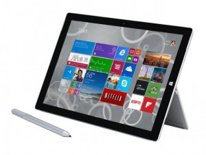 With the Surface, Microsoft’s latest CEO stole a few pages from the Apple design manual, and engineered a top-quality piece of hardware. It’s physically in the same class as the iPad: thin, light, and no keyboard dragging it down (like there is on almost every TabletPC device made during the old regimes). I can’t say enough good things about the ergonomics of these: how easy to hold they are, and well-built. The battery life is fantastic, even lasting a whole workday.
And it’s a “real” computer inside. Once you get past the early crippled “RT” models, a Surface can run all the same software you’d run on a laptop or desktop. This is key.
One of the best features of the Surface line are the screens. They’re sharp, with super-high resolution… almost iPhone sharp. And they’re the right shape. Every hardware company (but Apple, sorta) has been going wide-screen (16:9 or 1.78 ratio), basically assuming that the main thing people are going to do with their devices is watch movies on them. That’s a horrible format for… anything else. But especially for drawing. Apple’s iPads are 4:3 (1.33 ratio), which more closely matches the shape of a book (or painting or whatever), and can be used vertically or horizontally. The Surface isn’t quite that nice, but it’s 3:2 (1.5 ratio), which is good enough.
The bad news is that, among the pages they stole from Apple, are the ones about not “confusing” the user, by giving them as few buttons as possible. The Surface tablets have exactly four: Power, Volume Up/Down, and Windows-menu. The old TabletPC clunkers usually had some user-programmable buttons on the bezel somewhere, to make up for a physical keyboard not being available. You could configure them for “Save” or “Undo” or – if you’re an artist – “Shift” and “Ctrl” to use as tool modifiers in Photoshop. Surface doesn’t. (But there’s a work-around that makes this tragic omission fixable. I’ll get to that later.)
They crippled their stylus the same way. (They call it a “Pen”. Apple calls theirs a “Pencil”. They aren’t: they’re all styluses. (And yes, it’s “styluses”… this is English, not Latin.)) For years, Wacom styluses have had four fiddly-bits: the tip (for drawing), the other tip (usually for erasing), and two buttons on the barrel (which could be set to do any of a bunch of useful things). At first Microsoft copied this design (with the half-clever variation of treating the top end of the stylus more like the clicker on a ball-point pen, and letting you use it to launch an app, which turns out to be not be useful for anything). But they skipped the part about letting you program the buttons on the barrel. This was annoying, but at least they picked the two functions most-needed for drawing: erase and color-pick.
Then they read another page of the Apple manual, and the new stylus removed the buttons, replacing them with a clickable side. You might reasonably argue that this general squeeze-to-activate design is not a bad idea, but they kept the less-useful function: eliminating the press-to-erase feature. Every time I’ve complained to Microsoft about this, I get the response that you can flip the pen over to erase things, but that’s such a disruption to the way I’ve been drawing with a stylus forever that it’s useless. I sketch with it: making marks, erasing the ones that aren’t right, making new ones, erasing more, etc until it’s what I want. Flipping the pen over for every erase doesn’t work for that… this is supposed to be better than traditional media, not the same. This wouldn’t be an issue if they’d just let us select the functions for the button(s), but they can’t be bothered.
Which is a long way of saying that the original two-button Surface stylus is OK, but sadly it’s no longer in production. And I’ve had three of them stop working on me (or get really glitchy, which is just as bad). If you can get a few of them so you have a spare, it’s a good option. But the current model is useless to me.
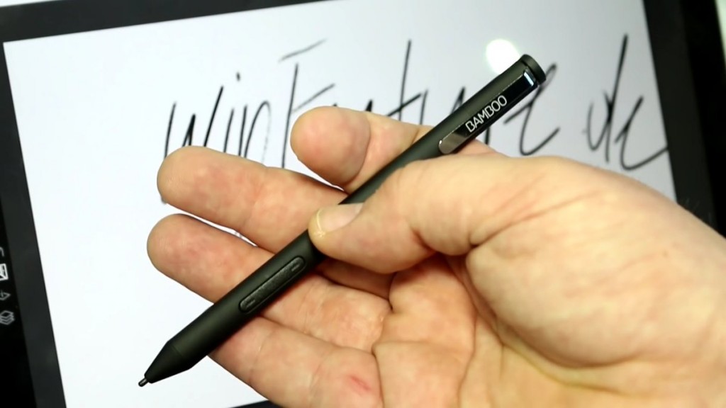
Fortunately, Microsoft has seen fit to license their stylus technology to Wacom, of all companies. So Wacom now makes the Bamboo Ink, a “universal” stylus that works with both Microsoft and Wacom tablets. It has two buttons. They aren’t programmable (that’s Microsoft’s fault: it’s a software feature), but at least the second button provides the press-to-erase feature. (If only they hadn’t swapped the buttons from the positions Microsoft used.)
So, if you’re going to use a Wacom stylus, why not a Wacom tablet? There are three reasons: the price, the cost, and the expense. Wacom’s cheapest MobileStudio Pro is $1800. Microsoft’s is $800. [Edit: MS has since introduced a slower, smaller $400 model.] Wacom understands the value of having buttons, and the MobileStudios have plenty of them with their “ExpressKeys”. But they aren’t worth paying a thousand bucks for. (You can probably do better by shopping for the earlier Cintiq Companion models, which are pretty much the same thing.) And they have a 16:9 aspect ratio… I’m not drawing movies, Wacom. Geez!
(On the other hand, one reason you might want to go with Wacom is size: the MobileStudios comes in two sizes, and one of them is big. It’ll cost you big bucks – they start at $2400 – but they have an almost-16-inch model that’s the size I’d really want to use. This is what I was talking about with spending lots of money if you have it. Microsoft also has some luxury-priced big Surfaces, if you have money to burn.)
A third option is Apple, and I’ve already touched on the problems there. The screen and weight and battery life are fine, but Apple has the whole Apple design manual, and they’re True Believers. The iPad Pro has the same buttons as the Surface, but no hacks are possible to make any of them useful for drawing. Their stylus has no buttons at all. You can’t even flip their “pencil” over and use the other end as an eraser. The only way to erase anything is to select an eraser tool in the app, erase, then select the original tool again. I… can’t… I just can’t. To be fair, I know some people who have an iPad Pro and “Pencil” and love it, and they produce great images with it. The new 10-inch model for $330 that works with the $100 stylus is a good price, and will be even better once they reach the second-hand market. I just can’t imagine trying to use one myself.
Another mark against the iPad is that it runs iOS. Nothing against the operating system itself, it’s actually well suited for a drawing tablet. But it doesn’t have the same range of software available for it as Windows (or macOS, if it was available in a tablet), and the software it does have – Autodesk’s Sketchbook seems to be a favorite – tends to have fewer features.
All of this has been assuming that you want a self-contained tablet: computer, screen, and drawing surface. If you don’t mind being tethered to a desk by some cables, there are some additional options. The first is to pull the drawing surface out and put it on your lap, while the computer and display sit on a desk. This is basically how we did it in the 1990s, using tools like the Wacom Intuos tablets, which are still available, with new ones running $100-200. (Used models and off-brand tablets are even cheaper, and can work pretty much as well.) The key advantage of this is that you can connect it to a computer you already own. Another “advantage” is debatable: it puts the stylus in your lap or on the desk, while your display is up in front of your face. Some people have difficulty getting the hang of this, because it’s unnatural. But it means that your hand and stylus tip don’t get in the way of what you’re looking at.
The other way to separate your components is to pull both the drawing surface and display out, and leave the computer on the floor or the corner of your desk. This is what the Wacom Cintiq (and its less expensive alternatives) involve. Like the Intuos approach, this lets you take advantage of an existing computer. It’s a more natural drawing experience, like on a Surface/MobileStudio/iPad. But an advantage over that approach is that you can get significantly bigger screens this way. Wacom will do their best to break your budget, but Huion, Yiynova, and Ugee have 13″–21″ display tablets at prices ranging from a few hundred to several hundred dollars. (But pay attention to screen resolution: a 19″ screen with the same resolution as a 13″ laptop doesn’t do you any real favors.)
Software
 Hands down, the best software for making comics digitally is Clip Studio Paint, previously known as Manga Studio, from Celsys. It’s available for both Windows and macOS, which is handy if you use both. (For example, I do lettering on my Mac Mini, because it has a keyboard and a mouse. I use Dropbox to synch everything between my Surface and my Mac.) There’s also a version for the iPad, but it requires a monthly subscription, which is a horrible way to license software, and it doesn’t synch files as easily as just using Dropbox.
The most common alternative to CSP is Photoshop, which also requires a monthly subscription now, making it infinitely more expensive than just buying a license to Clip Studio Paint. But Photoshop is an inferior tool in many ways. As the name indicates, it was designed for things other than drawing, and retains those features at the expense of a drawing focus.
 CSP was built specifically for making comics. For example, the full-featured EX version supports multi-page documents. Each page is its own computer file, so you can work on a 200-page graphic novel without bringing it to its knees, but you can manage the whole book within the program.
It has tools for making panels: you just slice up the page and it gives you panels with gutters between them. And you can configure it to treat each panel as its own little universe, so that if you scribble into the gutters, nothing shows up. Or drop a background into it, and it stays within the panel.
A really useful feature for those whose drawing skills are a little shaky is CSP’s line-stabilization. You can set it to smooth them a little or a lot, depending on how much you need. I’ve set up custom brush tools: some with stabilization to draw nice smooth curves, and others without to draw quick scratchy stuff, like shaggy hair.
CSP has tools specifically for making word balloons, and tails that automatically merge into them. You can use standard shapes or draw your own custom balloons. Unfortunately its thought balloons/tails suck.. those are out of fashion, but CSP really should do a better job of this. (And to put it in context, Photoshop doesn’t even know what a thought balloon is.) The lettering tools overall are kinda weak, to be honest. For example, the program doesn’t do ligature substitution, and you can’t rotate text or put it on a curve. But for the basics, the tools are easy to use.
One of my favorite features of CSP is how the magic-wand tool works as a coloring aide. You can set it to ignore small gaps in the lines, so if your ink lines are a little sloppy, it won’t autoselect the whole page. You can also set it to automatically over-select by just a little bit, which is invaluable in making sure that you color all the way up to (and a little under) the black lines, without little white gaps or a “halo”. These two features are giant time-savers in coloring, and since I found them in CSP, I haven’t used Photoshop to color a single panel. (I had a coloring job recently who understandably wanted the finished pages as Photoshop files, so I did all the work in CSP then converted them.)
An invaluable feature for working on a tablet is a customizable button bar that lets you save, cut/copy/paste, and every other function just by tapping on them. Every program used to have these, but amazingly, Photoshop doesn’t: you need to go thru the menus or use keyboard shortcuts! How do people put up with this?
CSP has its faults too. The menus, error messages, and other on-screen prompts are all written in Engrish, which can be difficult to decipher. I’ve already bitched about the lettering tools. But instead of addressing these problems, Celsys is working on new features like animation, which is a scary digression away from tools for making comics. But even so, it’s still the best toolkit out there, and definitely the best for the money.
On the Cheap
So let’s talk money, and how to save it. I put together the hardware and software I’m using for under $500. That required “cheating” by buying my Surface Pro 3 used. It set me back just over $300, plus $80 for the Bamboo Ink, and $80 for CSP on sale. The newer Surface Pro 4 and newest Surface Pro We’ve-Decided-To-Stop-Using-Numbers appear to be better machines, but they’re more expensive. For a year, I used the smaller Surface 3, which was… adequate. The screen is smaller, and the low-power CPU is underpowered, which can result in more lag when using stabilization or textured brushes. It cost me about $200 used. I replaced it because the screen is going bad, which is apparently not a common problem, but it happens enough to be wary of. [Edit: the Surface Go is an updated version of the S3, presumably with more horsepower. A new one with a stylus will set you back $500 for the base model… not too bad.]
Before the Surface, I used a couple of TabletPC “convertible” laptops. I’ve already called these “clunky”, and they are. They’re laptops that let you swivel the screen around and fold to use them like a tablet. They’re much heavier than a Surface, MobileStudio, or iPad, and the designs for folding away the keyboards are… clunky. But they run full versions of Windows and apps, and use Wacom’s stylus technology, and they’ll get the job done. And because they’re “obsolete”, you can pick them up on eBay for even less, maybe $100–200. Mine was a Lenovo Thinkpad X201, if you want a model to look for. A Thinkpad X60 served me before that if you’re looking for the cheapest usable device possible.
If you’re in the position of saving up pennies for digital drawing tools, you might want to consider going old-school instead. Before people started drawing right on screens, we used tablets as just input devices sitting on the desk or in our laps, with a desktop computer. You can pick up a used Wacom Bamboo or Intuos and add it to a computer you already have, for well under $100. Then down the line someday, you’ll be able to pick up a used Surface Pro 3 for $100.
A penny-pinching option for software is the misleadingly named Clip Studio Paint Pro, which takes out some of CSP EX’s features at a much lower price: $50 every day, and it periodically goes on sale for even less. EX normally sells for $220, which isn’t bad, but also goes on sale for like $80 from time to time.
 If you’d rather have a more general-purpose tool similar to Photoshop, look at Affinity Photo. It’s a $50 program (no subscription required) that can serve as a drop-in replacement for Photoshop. And if you want something like Illustrator, Affinity has Designer. Both are a great deal if those are the kinds of tools you want.
 If you absolutely don’t have any spare money to spend on software, you can search out a download of Adobe Creative Suite 2, and the activation key that Adobe published for it when they dropped all support for it. Note: it won’t run on modern macOS, and there are some tricks to getting it to work well on modern Windows. There are also some free/open-source programs to try: The GIMP for Photoshop-like tools, and Inkscape for Illustrator-style tools.
Essential Hacks
One problem with touch screens is that every time you touch them, the computer thinks you’re telling it to do something, even if you’re just resting your hand on the screen to draw more comfortably. Tablets that combine touch and stylus input use a technology called “palm rejection”, which is supposed to ignore casual contact by your hand when you’re using a stylus. It doesn’t work well enough. I thought there was something wrong with my Surface or CSP until I figured out that the random dots it kept putting in my art were because my hand touched the screen briefly. Plus there were times when it would mistakenly think I was trying to scroll, pinch-zoom, or something. Being able to manipulate the app with your fingers is a nice idea, but it’s more trouble than it’s worth. Go into the Device Manager for Windows and disable the touch-input device. You’ll thank me later.
 The Surface’s shortage of buttons is annoying, but there’s a way to overcome it. There’s a two-way rocker button on the edge to adjust the volume, but Microsoft doesn’t give you a way to configure it to do anything else. For that you’ll need a program called Auto Hotkey. I’ve used it to reconfigure those buttons to mimic pressing the Shift and Ctrl keys. This enables me to use Shift to constrain tools in CSP (such as to draw a perfectly horizontal panel line) and Ctrl to select multiple items by clicking on them one at a time. You could change them to any other keystroke, such as Ctrl-Z or Ctrl-S, but CSP has on-screen buttons for those functions, so I’d recommend using them for Shift and Ctrl, which you can’t do any other way… except the on-screen keyboard.
 Speaking of which, Windows 10’s on-screen keyboard is a glitchy, badly designed mess. There are actually two different systems: one for tablet use, the other a leftover from the TabletPC era. Both are lousy. But from time to time a cartoonist will need to use a “keyboard” on the Surface (like to fix a lettering typo). Comfort Software’s on-screen keyboard takes up less space on the screen, you can call it up or close it whenever you want, and it lets you select which layout to show you. It’s a good little utility, worth paying ten bucks for.
Conclusion
So there you go: everything you need to make comics without touching a sheet of paper! Don’t get me wrong: I like traditional media, and the people who make comics with actual pencils, pens, and brushes get my respect. But those tools were holding me back, and the ability to undo all of my mistakes has been a huge liberator for me. Let me know if I’ve missed anything, gotten anything horribly wrong, or you have questions!
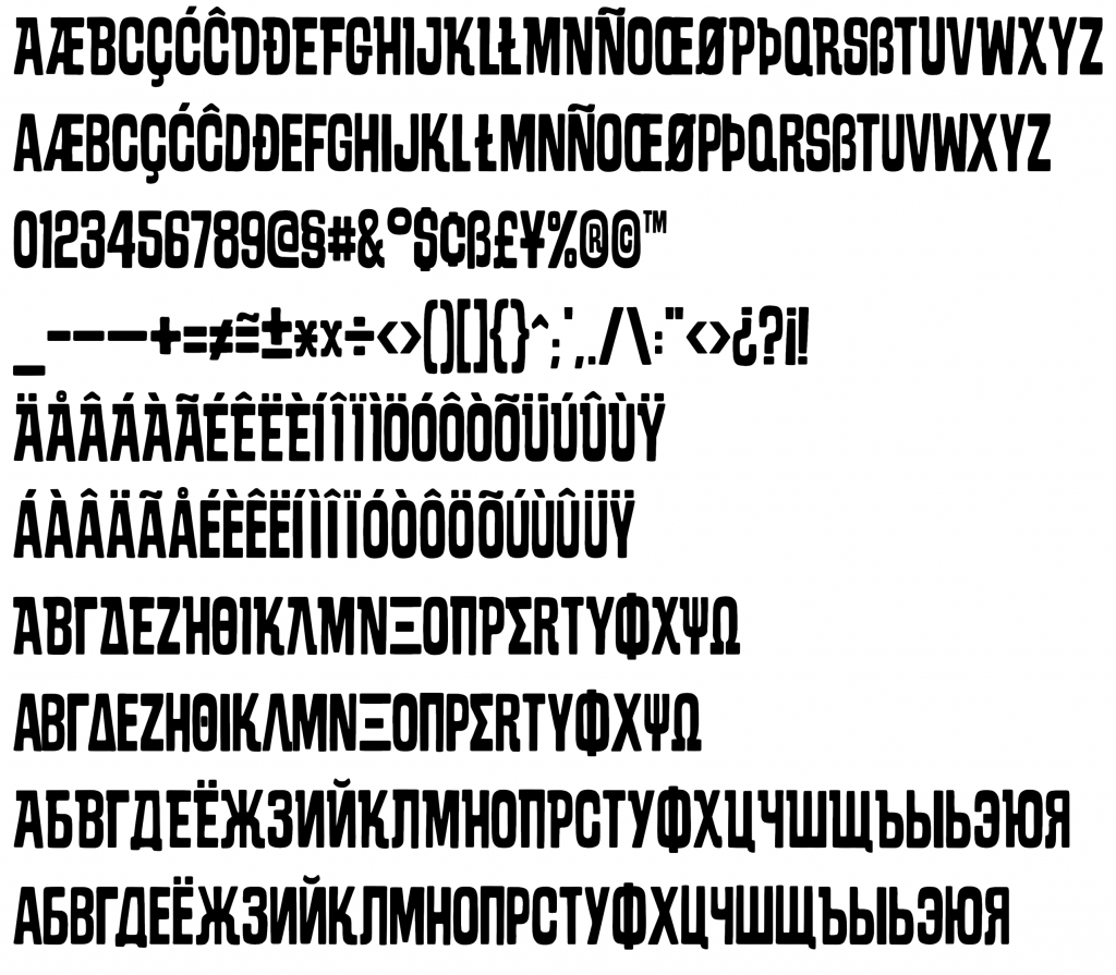
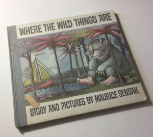 Where The Wild Things Are is a font inspired by the lettering on the cover of the classic picture book by Maurice Sendak.
 I know this treads closely to backward-looking nostalgia, but I really do think the Web was better with 1) BLOGS for people who have a lot to say, and 2) FORUMS for people who want conversations.
 If you’re looking for a fairly affordable tool for digital drawing, the upcoming Surface Go looks like a viable option. Microsoft doesn’t seem to have a coherent strategy for the Surface line, but this is effectively the replacement for the Surface 3 (cheaper, smaller, and less powerful than the Surface Pro 3) which they discontinued a couple years ago when they upgraded the Pro model to version 4.
 But there’s a common misconception that this requires spending a lot of money. You can. And if you have it, you probably should, because you can get some pretty fine tools for, say, $5000. But you don’t have to. You can equip yourself with the same tools that I use for under $500. And if you’re intent on it, you can at least get started for about $50.
 With the Surface, Microsoft’s latest CEO stole a few pages from the Apple design manual, and engineered a top-quality piece of hardware. It’s physically in the same class as the iPad: thin, light, and no keyboard dragging it down (like there is on almost every TabletPC device made during the old regimes). I can’t say enough good things about the ergonomics of these: how easy to hold they are, and well-built. The battery life is fantastic, even lasting a whole workday.
 CSP was built specifically for making comics. For example, the full-featured EX version supports multi-page documents. Each page is its own computer file, so you can work on a 200-page graphic novel without bringing it to its knees, but you can manage the whole book within the program.
 If you’d rather have a more general-purpose tool similar to Photoshop, look at Affinity Photo. It’s a $50 program (no subscription required) that can serve as a drop-in replacement for Photoshop. And if you want something like Illustrator, Affinity has Designer. Both are a great deal if those are the kinds of tools you want.
 If you absolutely don’t have any spare money to spend on software, you can search out a
  The Surface’s shortage of buttons is annoying, but there’s a way to overcome it. There’s a two-way rocker button on the edge to adjust the volume, but Microsoft doesn’t give you a way to configure it to do anything else. For that you’ll need a program called