Skip to content

Dennis and the Menace

No Comments

Someone mentioned that “Dennis the Menace” is actually two distinct characters – who debuted the same day in the UK and the US – and I thought it would be fun to see these two menaces-to-society grow up a little and meet.

Dennis US is a fairly benign menace, who is generally oblivious to the chaos he produces. He mainly annoys his grumpy neighbor “Mr. Wilson” by not realizing that the old man hates him. Dennis UK is more intentionally malicious, and menaces the character “Walter the Softy” because he’s a stereotypical sissy. I’d like to think that Dennis UK has outgrown his insecurity and embraced the softies in his life.

DennisAndTheMenace_001

Less YouTube, More Nebula

No Comments

NebulaI’ve been watching more “edutainment” programming in the past few years, for a variety of reasons. For a long time I ignored YouTube as a cesspool of shitty “influencers”, an algorithm notorious for promoting conspiracy hoaxes, and comments sections that made Twitter look nurturing by comparison. But there’s some good stuff there, and I’ve been catching up on some of it.

But YouTube is still YouTube. I hate how it interrupts science explainer videos mid-sentence with shitty ads for perfume, monster trucks, and Shark-Tank rejects. And it’s Google: one of the top 5 privacy-invading, Al-worshipping, toxic tech companies on the planet. But what else are you going to use?

NEBULA. It is isn’t a replacement for YouTube, but it’s an alternative to it, at least for the kinds of material I’m actually interested in. I’m not saying it’s all primo content, but… they do have standards, just like YouTube does not. It isn’t “WokeTube” but it’s clear that the folks running it have a generally progressive point of view, and are trying to deliver honest information and reasonable opinions, while being entertaining.

The business model is also more wholesome than YouTube’s: instead of sponsorship contracts that require presenters to interrupt themselves to cheerfully promote sometimes-shady services (in addition to YT interrupting them)… the creators own a share of the company, and get paid directly from subscription fees, scaled based on people watching their programs and signing up. That’s right: It’s majority-owned (with some outside investment) by the same people who are making the videos!

Yeah, I said “subscription fees”. If you pre-pay for a year, it’s $5/month, plus there are introductory discounts if you use a particular creator’s link. Totally worth it. A lot of this material is available on YT, but at the cost of ads, invasive tracking, and pervasive recommendations to watch garbage.

A few personal recommendations: Half as Interesting (brief sarcastic dives into odd topics), Legal Eagle (explanatory rants about current law issues), Not Just Bikes (urban planning), Real Life Lore (geopolitical analysis, including stuff YT won’t let him cover), Tale Foundry (lightly animated essays about storytelling), Jessie Gender (trans perspective on geek culture), and for simple lulz Jet Lag: The Game (Nebula creators chase each other around the world).

Escaping from Antisocial media

No Comments

Remember BLOGS? They were kinda neat: you could talk about whatever you were thinking about, you could link to interesting articles, people could comment on your posts… kinda like having a social-media account, but without some rich fascist deciding what you may say.

In recent months – and especially recent weeks – I’ve seen several people I follow on Facebook backing away from it and going back to their blogs: Jim Wright, Andy Borowitz, and Wil Wheaton come to mind. When I first signed up with FB, it was largely to direct people to my site, and of course the head FascistBot figured that out, and has done all he can to prevent people from doing that.

The problem is that it’s not as easy to follow blogs as it is to follow FB accounts. Which brings us back to a technology that was built for the blogosphere: RSS. It works kinda like the “subscribe” feature on YouTube, notifying you when the sites you follow have new stuff. I’ve never used it much… I used to just use a bunch of bookmarks to check on websites I was interesting in. Google had a pretty good RSS manager, but nuked it because that company is also becoming shittier by the year. I’m trying out Feedly, which I’ve read good things about.

And I’m gonna try to get back to using *my* blog too. If some tiny part of why somebody is on FB is because they want to keep up with what I’m thinking, doing, creating… I sure as fuck don’t want to contribute to *that*.

“Where The Wild Things Are” font

WTWTAbook
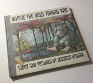
Where The Wild Things Are is a font inspired by the lettering on the cover of the classic picture book by Maurice Sendak.

I started this project because I wanted to evoke the spirit of that book, for the title typography of a comics story I was writing and drawing. I searched for a look-alike font, but came up with nothing.

The simplest solution would have been to assemble the title and credits ransom-note style, but there was a problem: Not all of the letters I needed were included in the title and credits on the book cover (most importantly: J and Q… as in my name). I had to “reverse engineer” those characters from the design of the others. There was also the issue that I couldn’t scale the letters without them getting blurry. The solution was to create a proper digital outline font.

While I was at it, I figured I might as well fill out the whole alphabet, including the characters I didn’t need. Doing numeric digits seemed easy enough. And punctuation. And letters with díäçrîtić marks. Heck: why not do the whole keyboard? I mean… I couldn’t imagine why anyone using this font would want gylphs for @¢§£™€… but why not include them? And because it felt like a fun challenge: Greek and Cyrillic.

An interesting characteristic of this typeface is that there’s more than one version of each letter. There’s one version of the letter W with a serif in the upper left corner, and one without. Same with the letter A. There are two different kinds of S. And so on. I accommodated this by assigning one version to the uppercase version of each letter, and the other to the lowercase. So if you want a serif, hold down the Shift key when you type that letter, otherwise don’t.

While I was working on this, I learned that the book’s cover lettering was done using a commercial typeface called Safari. WTWTA is not a proper substitute for that. Most importantly, Safari includes a wild array of ligatures: special versions of letter pairs that interlock with each other. I’m not talking about kerning V and A to close the gap between them, but things such as a small letter I that could fit under the crossbar of T. It’s one of the nifty features of the font, but Sendak didn’t take advantage of it. Trying to replicate that would be insane… at least more insane than I am.

[ DOWNLOAD WhereTheWildThingsAre-Regular.otf ]

Where The Wild Things Are font sample

Clip Studio Paint 2.0: So Many Bad Options for Long-Time Users

No Comments

I’ve been thinking about the changes in Clip Studio Paint’s business model, and it’s remarkable just how very shitty ALL of the options they offer are. It takes imagination to think of SEVERAL different ways to screw the people who bought perpetual licenses, and encourage them to NOT give you money. If you are someone who bought CSP 1.x, here are your options:

1) You can just stop upgrading when 2.0 comes out. Which means that when/if Celsys ever brings their lettering tools up to par… too bad.

2) You can buy 2.0 for full price. But when 2.1 comes out (not 3.0… but the very next any-new-features update)… you have to pay full price again. They typically release new features like this a couple times a year, which has been great… until now. Even if you only upgrade once a year, that’s $219 for the EX version. That’s EXPENSIVE for maybe a handful of features that are actually useful to you. It’s like they’re begging you to scrutinize upgrades judgmentally, and maybe wait until 2.8 or whatever when there are enough reasons to be worth $219. (Also, because I use CSP on multiple computers – a drawing tablet sucks for lettering, and a full-size tablet sucks for travel – multiply that out.)

3) You can buy annual “update passes” which (they promise) will be less expensive. These will allow you to install 2.0, then 2.1 when it comes out, and so on. But if you ever stop buying them: BAM! You have to go all the way back to VERSION 1 (assuming that still runs on your future OS). If any of your files depend on new features… Celsys says you’ll probably still be able to open them, but it’s hard to guess what will happen. Like, if they improve the lettering tools to allow distorted text… maybe it’ll go back to being straight? Who knows. This is, frankly, the most unethical option they’re offering: if you’ve paid for updates, you should be allowed to keep them.

4) You can switch to their software rental model (which is of course their preference). For example: one license of CSP EX is $72/year, and two is discounted a little at $99. This is effectively the same thing as option 3 (which has no multiple-seat discounts), so I’m not sure why they’re bothering with that one. If you stop subscribing, the software just stops working completely, but your version 1 license should still work, I assume.

There are also some details in this announcement about support periods and bug fixes. Those patches will still be free, and they’ve committed to fixing known bugs in version 1 until version 3 comes out, and version 2 will be supported until version 4. That’s all very reasonable. They can’t be expected to keep fixing old software indefinitely. Their policies about not supporting certain old versions of Windows and MacOS are also reasonable: they don’t promise it will work correctly, but they don’t stop you from trying.

Product update flowchart

9/10,11,12

No Comments

I originally created this comic as part of my JAQrabbit Tales series, but finally decided that it didn’t really work well as part of that series, so I reworked it as a stand-alone story. As a commentary about how our society changed after 9/11, it’s an admittedly simplistic one, but… there it is.

9-10-11-12_001 9-10-11-12_002 9-10-11-12_003

#NUdecember

No Comments

Nudecember prompt list by ComeNozes on DeviantArt
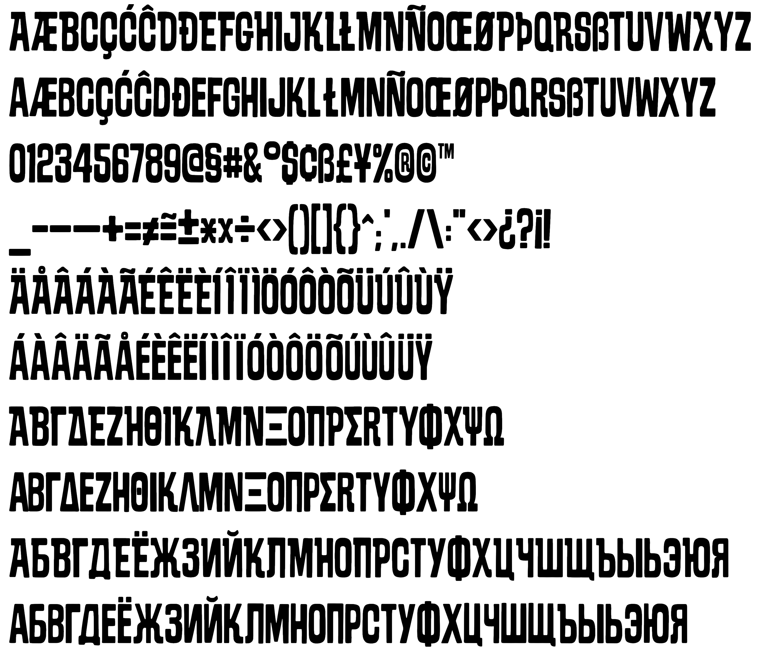
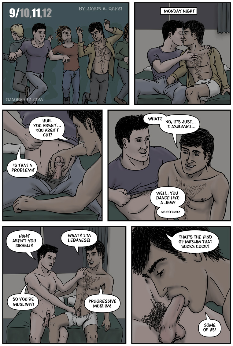
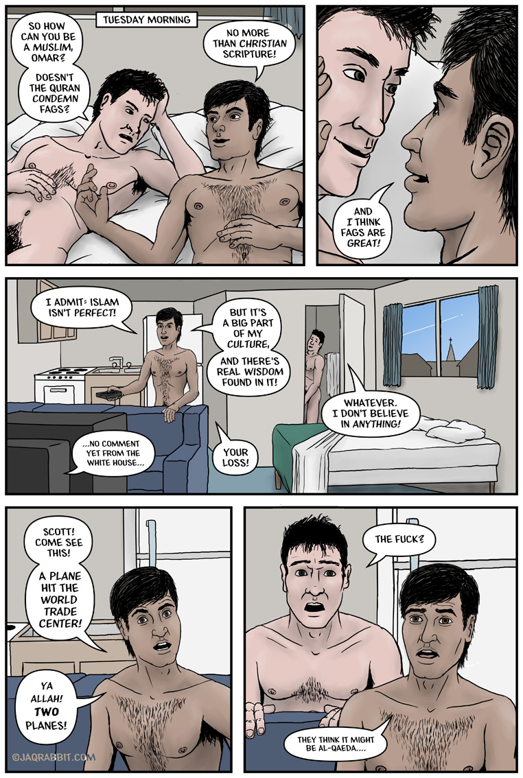
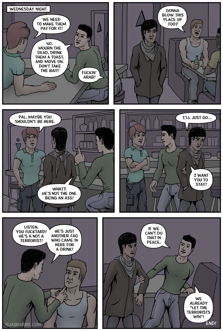
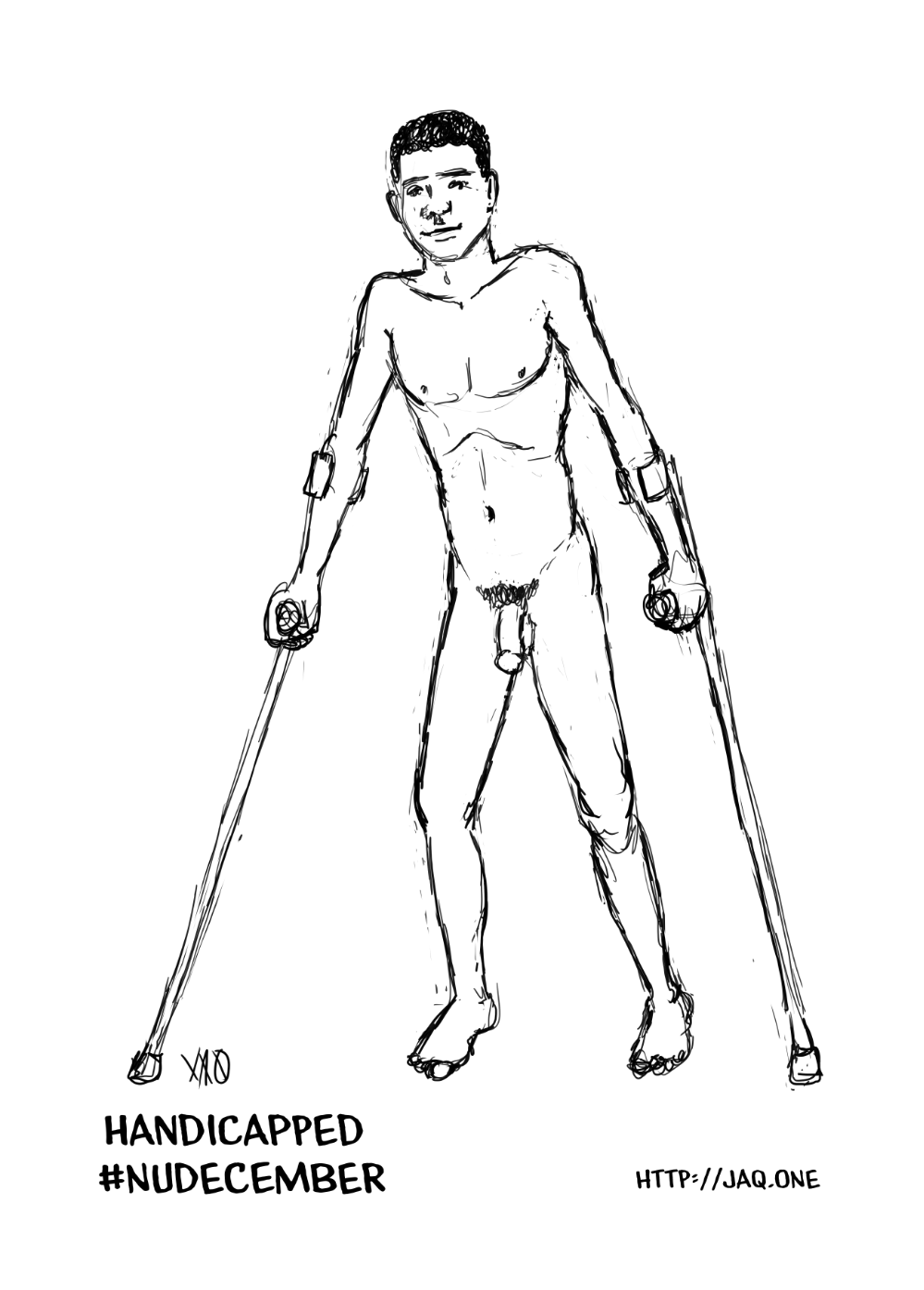
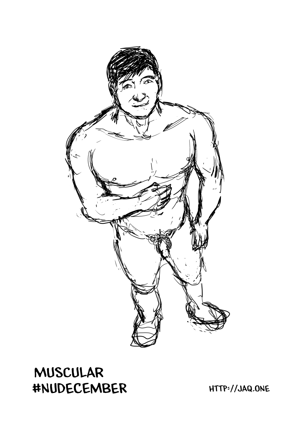
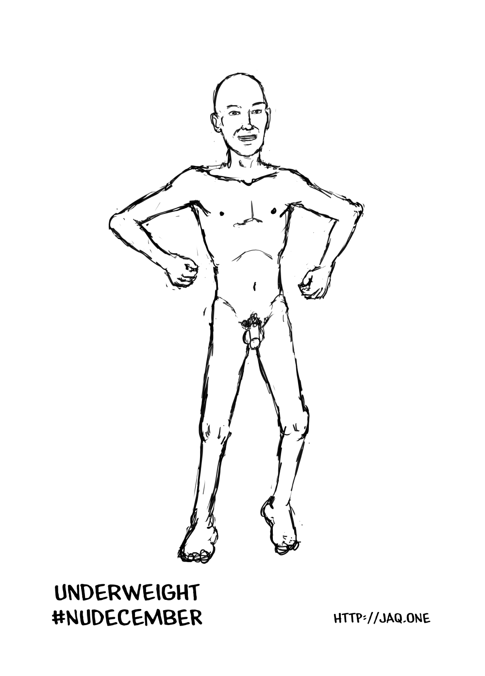
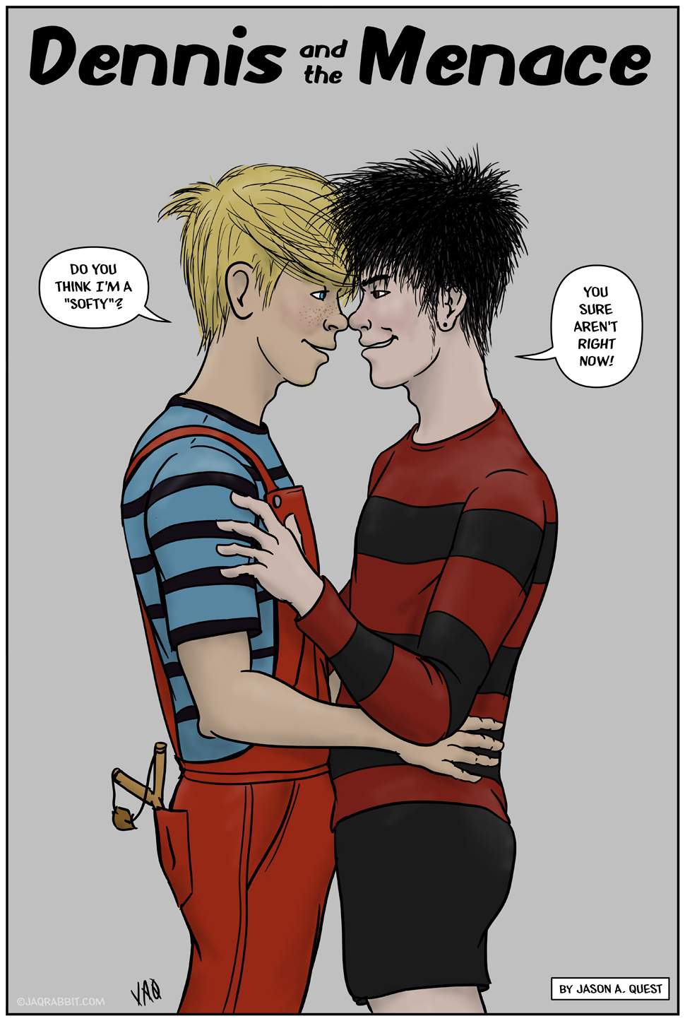
I found out about this #NUdecember challenge just as it was about to start, and intended to do it, but… haven’t. I had some time yesterday and worked on a few to catch up. I intend to do them all, and I’ll post each of them here with the appropriate date… which will make it look like I was doing them every day :) .